

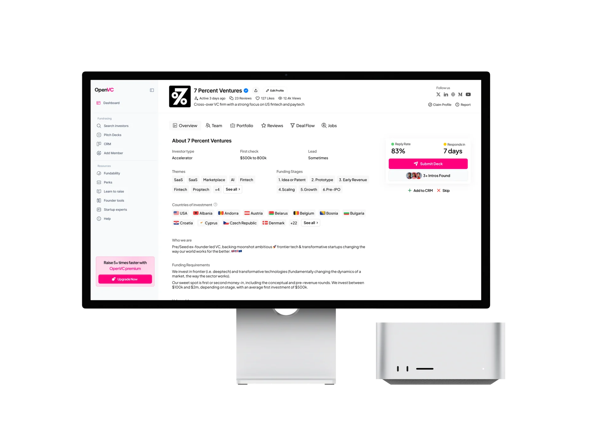



OpenVC hero design illustration

ISLAMABAD , PAKISTAN

CASE STUDY

Redesigning 10,000+ Investor Profiles

venture capital

Product design

OpenVC hero design illustration
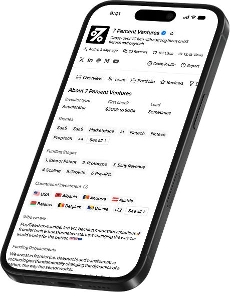
OpenVC mobile investor profile
OpenVC investor profile mobile interface

01 / OVERVIEW

An Investor profile with two jobs to do.

OpenVC brings investor discovery, pitch-deck sharing, introductions, and fundraising tools into one platform. This project focused on a central part of that experience: the investor profile. The redesign needed to help founders decide who to approach while giving investors a polished, credible page they would want to share.

Two audiences

Founders evaluating fit. Investors communicating their identity.

One reusable template

A consistent structure for profiles with different amounts of content.

Desktop + Mobile Experience

Investor profiles within OpenVC’s fundraising workspace.

02 / My contribution

Turning profile data into a decision making experience.

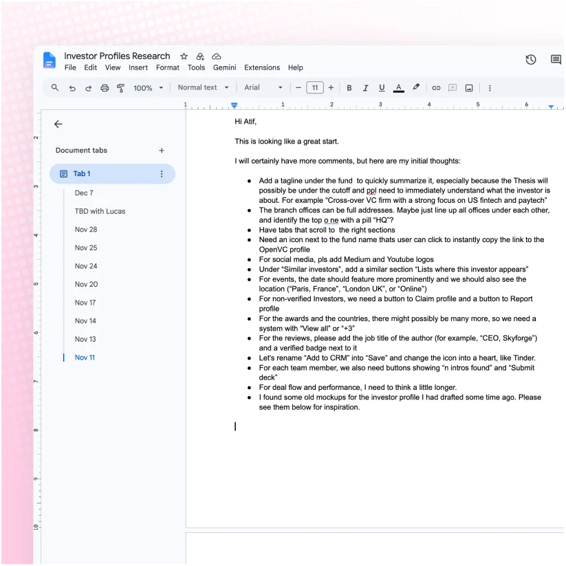
I worked on the profile redesign from competitive research and Figma wireframes through iteration and detailed interface design. The work balanced what founders need to evaluate with how investors want to present themselves.

OpenVC contribution design illustration

Research

Reviewed competing profiles and presentation patterns.

OpenVC contribution design illustration

Structure & iteration

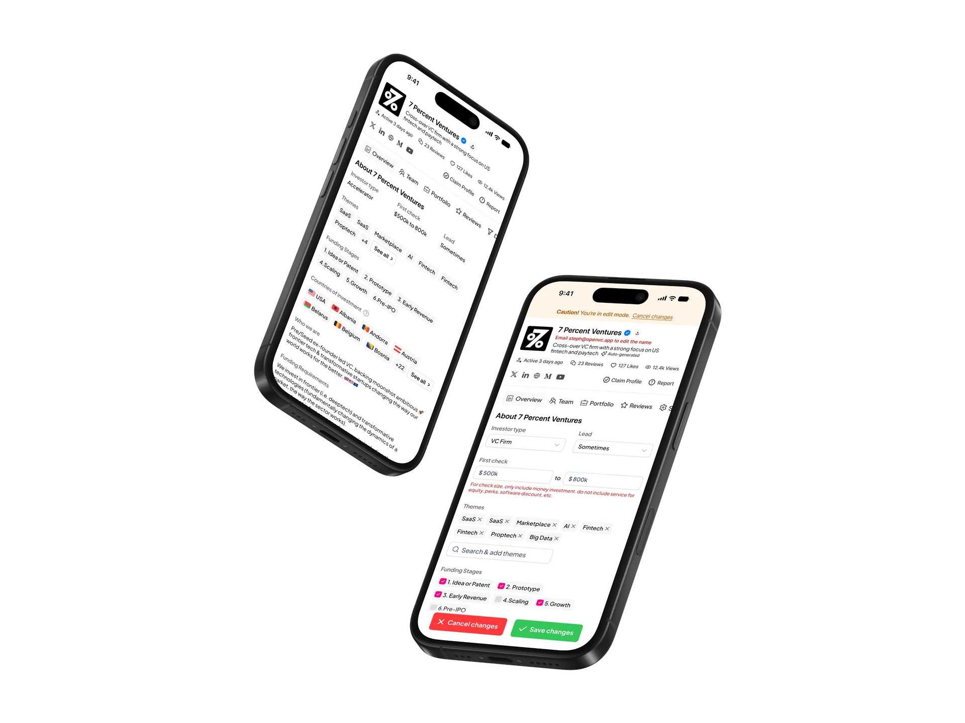
Explored nine iterations, including logged-in, logged-out & edit mode layouts.

OpenVC contribution design illustration

Interface design

Refined hierarchy, navigation, profile modules, and outreach actions.

03 / Timeline

One Page but a substantial iteration cycle.

The process involved five days of competitor research and roughly three weeks of wireframe iteration. High-fidelity design followed, with further changes to the arrangement of content. The project was completed in 1.5 months.

  1. 05 days

    Research

    Studied competitor profiles and identified useful patterns.

  2. 03 weeks

    Wireframe iteration

    Explored nine versions and addressed shared feedback.

  3. 02 weeks

    Detailed design

    Resolved the profile hierarchy and applied the visual system.

04 / Problem statement

Useful information was not enough.

The existing profile presented investor information, but the stated business concern was that investors did not find the page compelling enough to share with their networks. For founders, the design challenge was making a dense set of facts useful during a fast assessment of fit.

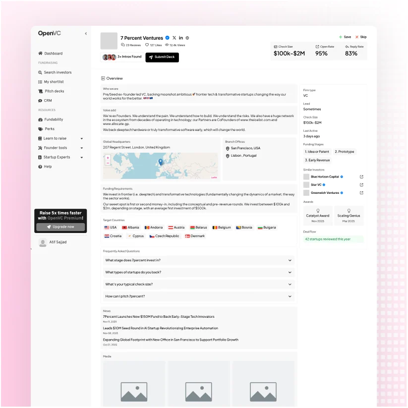
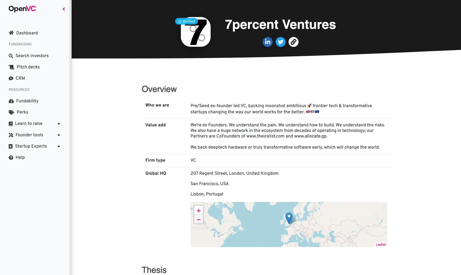
OLD INVESTOR PROFILE

OpenVC problem design illustration

How might one profile help a founder decide and give an investor a page worth sharing?

05 / Solution

From directory entry to investor destination.

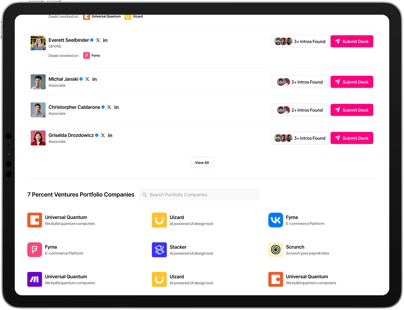
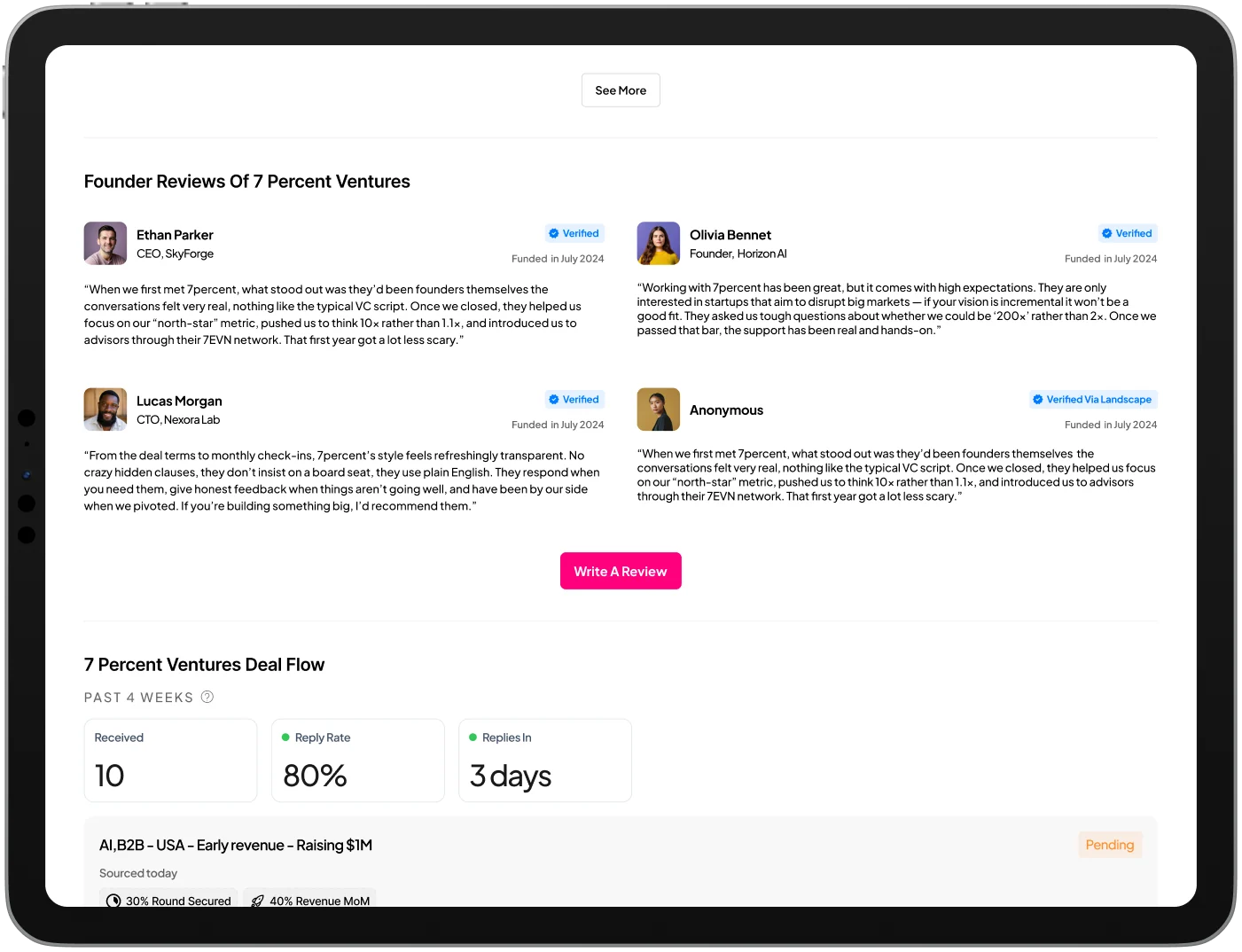
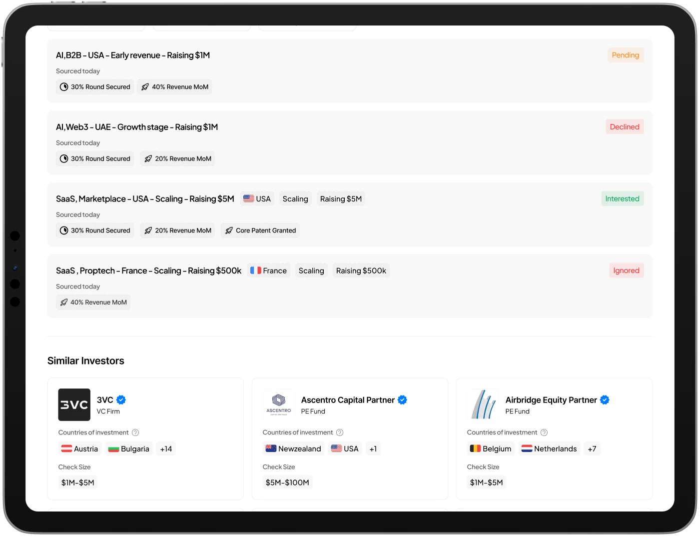
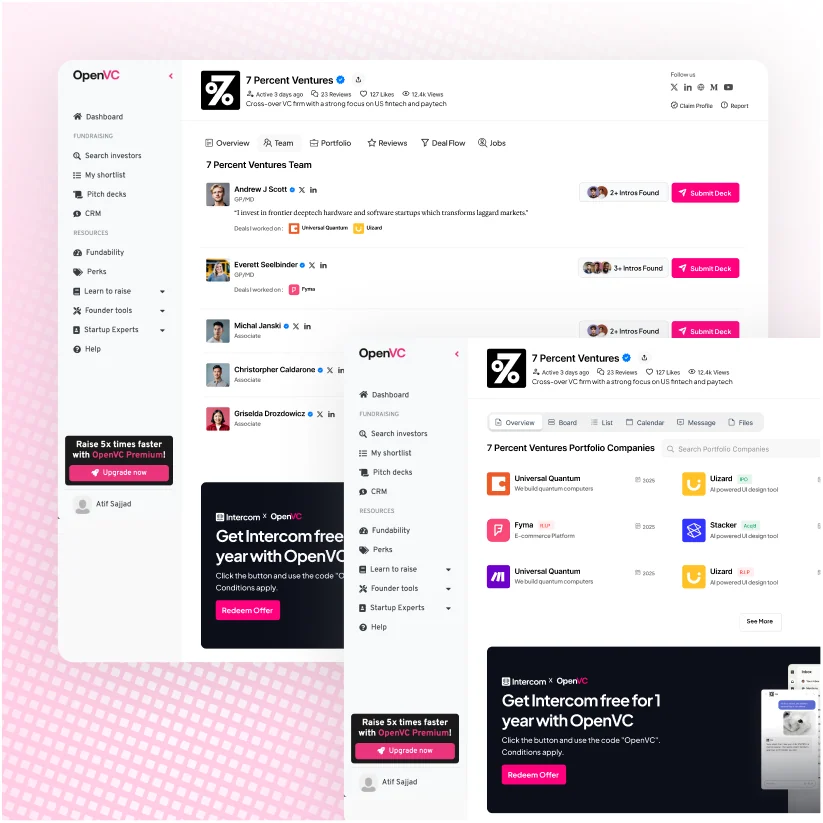
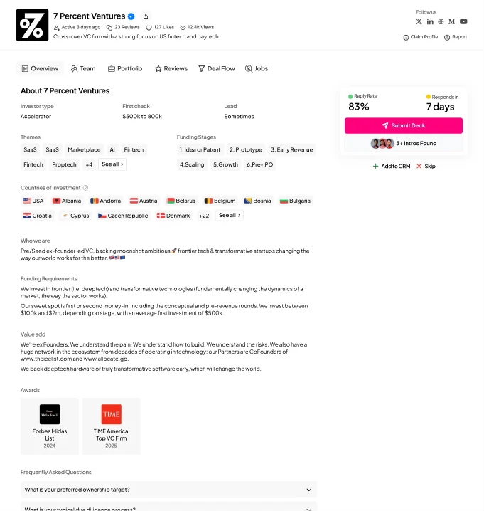
The redesigned profile combines a structured investor overview with deeper sections for team, portfolio, reviews, deal flow, and jobs. It supports a quick scan first, with more detail available as the founder’s interest grows.

Redesigned investor overview, team, and deal flow screens

06 / User personas

Two perspectives. One shared surface.

The profile must serve the person represented on the page and the person deciding whether to make contact. These two working personas summarize the needs implied by the redesign; they are not interview participants.

The investor

01

Context

Needs a profile that can represent the firm beyond the platform.

Friction

A generic listing that understates the team, thesis, track record, or requirements.

Needs

A shareable identity, clear investment criteria, credible proof, and accurate content

Jordan Lee

Partner at an early-stage fund

Illustrative user persona portrait

The founder

02

Context

Compares several profiles while preparing a fundraising round.

Friction

Scattered eligibility details, uncertain responsiveness, and unclear contact routes.

Needs

Investment fit, credible evidence, introduction options, and a visible next action.

Alex Morgan

Early-stage startup founder

Illustrative user persona portrait

08 / Empathy maps

Different questions behind the same page.

A founder arrives with a fit decision to make. An investor wants the page to represent the firm accurately. Mapping both perspectives keeps usability and presentation connected.

Jordan Lee
The investor

Jordan Lee

Says

“This page should explain what makes our firm different.”

Thinks

“Will relevant founders understand our focus before reaching out?”

Does

Reviews how the firm is represented and considers sharing the profile.

Feels

Protective of the firm’s reputation; proud when the page tells a credible story.
Alex Morgan
The founder

Alex Morgan

Says

“This page should explain what makes our firm different.”

Thinks

“Will relevant founders understand our focus before reaching out?”

Does

Reviews how the firm is represented and considers sharing the profile.

Feels

Protective of the firm’s reputation; proud when the page tells a credible story.
Jordan Lee
The investor

Jordan Lee

One profile. Four perspectives.

Says

“This page should explain what makes our firm different.”

Thinks

“Will relevant founders understand our focus before reaching out?”

Does

Reviews how the firm is represented and considers sharing the profile.

Feels

Protective of the firm’s reputation; proud when the page tells a credible story.
Alex Morgan
The founder

Alex Morgan

One profile. Four perspectives.

Says

“This page should explain what makes our firm different.”

Thinks

“Will relevant founders understand our focus before reaching out?”

Does

Reviews how the firm is represented and considers sharing the profile.

Feels

Protective of the firm’s reputation; proud when the page tells a credible story.
09 / Wireframing & iteration

Nine versions to find the hierarchy.

The wireframe board shows nine versions of the investor profile. The early layouts explore long-form overview content, side summaries, profile actions, and supporting modules. Later work consolidates the page around section navigation and a more deliberate relationship between information and outreach.

AreaEarlier explorationFinal presentation
Core factsA right-side summary beside long overview blocks.Key investment criteria grouped at the top of Overview.
Outreach contextOpen and reply rates appear with header actions.Reply rate and response time sit with Submit Deck in a distinct panel.
Supporting contentMany modules sit along one long page.Named sections provide clearer entry points into team, portfolio, and reviews.

10 / Design decisions

Make the important parts easier to find.

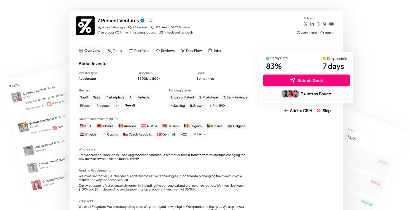
The final interface uses a compact header, labeled navigation, quiet content surfaces, and a strong magenta accent for key actions. The hierarchy supports both a quick scan and a deeper review without removing the information that makes each investor distinctive.

  1. 01

    Investment fit comes early

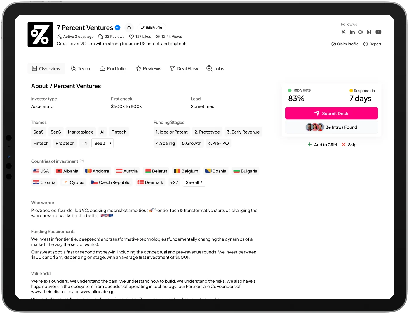
    Stage, themes, geography, and check information help founders judge relevance before reading the full narrative.

  2. 02

    Outreach gets its own space

    Response context, Submit Deck, and introduction options form a recognizable action area.

  3. 03

    People and proof add depth

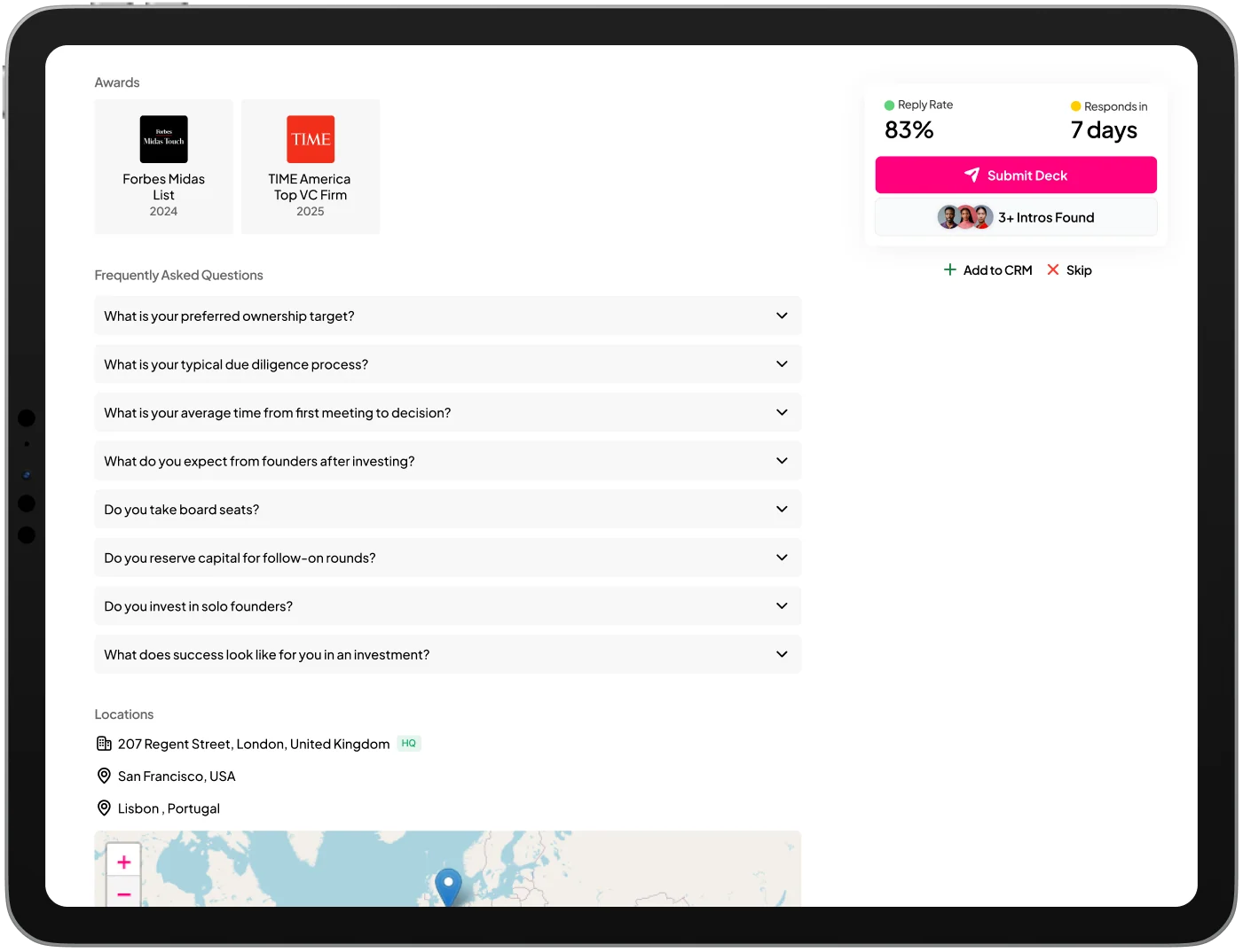
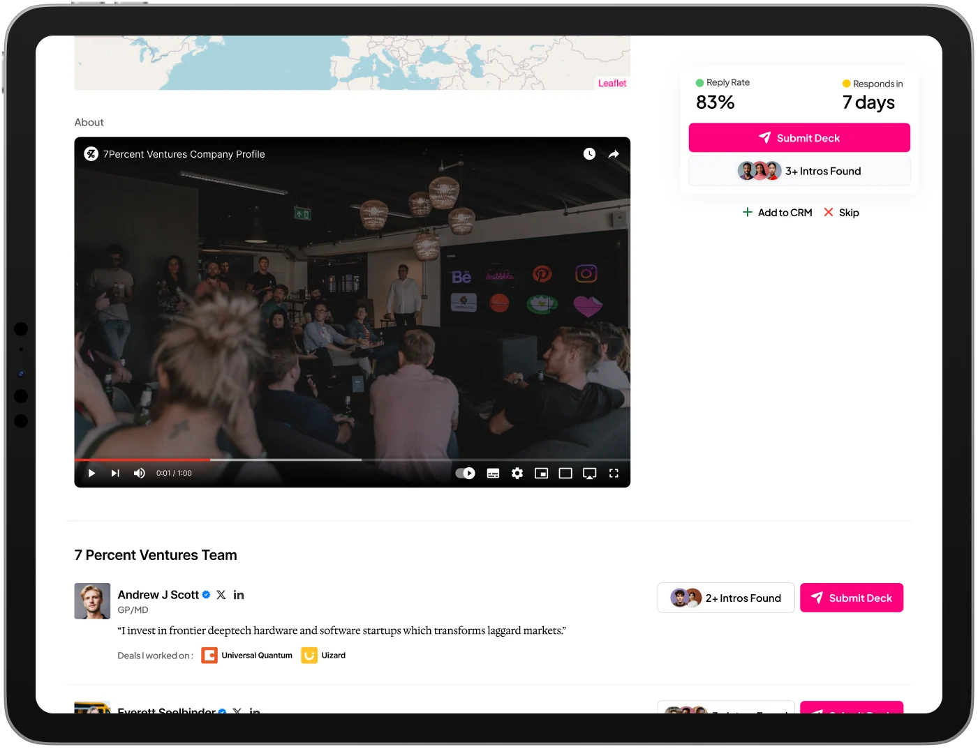
    Team rows, portfolio entries, and founder reviews give substance to the investor’s public identity.

  4. 04

    The profile supports different depths

    Labeled sections and “See all” controls let the interface summarize dense content while offering detail.

OpenVC investor profile with investment criteria and outreach panel

11 / Final design

A profile that explains, earns trust, and invites contact.

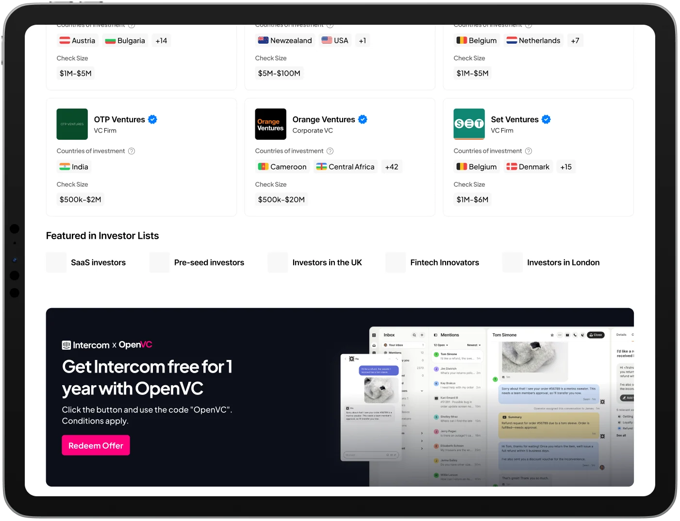
The final screens bring the investor’s story and the founder’s decision into one visual system. Overview establishes fit; Team makes the people approachable; Portfolio and Reviews provide evidence; Deal Flow and discovery modules add context and onward routes.

OpenVC Overview screen on an iPadOpenVC Investor details screen on an iPadOpenVC Team screen on an iPadOpenVC Portfolio screen on an iPad
OpenVC Reviews screen on an iPadOpenVC Deal flow screen on an iPadOpenVC Investor discovery screen on an iPad